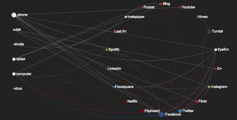
My digital life #1
As the Procrastination Zen Master that I am for a while now I've been thinking about the way I do things, how messy it is and how I can improve it - efficiency is the only way to fight my laziness :) . So yesterday I decided it was finally going to be the day, after all that knowledge that I gained from procrastinating* , so in good fashion I procrastinated for a while longer on how to go about this and decided that I needed some way to view it** , so google brought me to Sigma.js and after some surprisingly Saturday night productive bit of coding I think I actually have a good stab at what I wanted in the first place - which surprised me beyond belief.
So, what I wanted to understand, of what is my non-professional digital life was:
- what services do I regularly use
- how do these services interact with each other
- what devices to I use to consume the services
- what devices do I use to feed the services
This first attempt is merely empirical, all the data was pulled from my mind - that's as unscientific as possible - and the graph only partly answers some of the questions I asked , but it's meant to be a first iteration and the picture does tell me a few things already.
Devices
My phone is clearly the most used device - how much we changed over the years - both for content consumption and production. On the oposite end, the kindle,xbox and dslr are clearly very used for very very specific reasons and don't interact all that much with the cloud.
The tablet and computer, are similar in terms of connections but what the data doesn't show - empirically - is that the time I use both is superior to the phone.
Services
Service wise, Facebook is in the center of almost all things, above Twitter and Tumblr. Photography services combined are a big part of my life, and given that I don't duplicate content on all three (Flickr,Instagram,EyeEm) that part of my digital life really plays a large role. LinkedIn on the other hand is almost an independent nation, mostly because I make a point of not aggregating any of the other networks there, it's strictly a dynamic CV and the social network does not necessarily represent my other networks.
On the pure entertainment consumption side, Last.fm became a data aggregator for Spotify, Foursquare is almost always changed by third party tools (namely the Photo apps), Pocket and Instapaper are my File-for-procrastination tools and my blog and tumblr(s) normally represent what I filter out of the entire network.
Conclusions?
Nothing extremely surprising apart from how much I use my phone for these things, at least in terms of diversity as the data is far from complete. And maybe that, despite my own feelings, Facebook plays a bigger role than I though it would - having my family there is a big reason for it of course.
Shiny nodes and edges?
Oh yeah, part of the Yak Shaving agreement is that something remotely useful should always come out of procrastination and clearly the blog post is not it, so I guess the graph should be it . To produce it I used sigma.js with a bunch of data that I manually compiled - no extra brain cells were used in automating this yet - and a bit of CoffeeScript to compile the data and draw the graph.
IF you want a quick way to produce your own graph, have a look at the GitHub project and fork away, check the example folder and adjust the data to your own fashion, the structure should be pretty straightforward.
- that would be zero knowledge gained from procrastinating of course
** Shaved yaks, powered by procrastinators worldwide